A Study On The User Experience Of E-Commerce Website : A Customer Oriented Approach
E-commerce websites facilitate buying and selling goods online, offering users product and company information. As they grow in importance, businesses must prioritize effective user experience (UX) and user interface (UI) design to engage customers effectively. This study explores customer preferences in e-commerce sites and highlights the importance of robust UX/UI in enhancing consumer interest and behavior.
E-commerce websites facilitate buying and selling goods online, offering users product and company information. As they grow in importance, businesses must prioritize effective user experience (UX) and user interface (UI) design to engage customers effectively. This study explores customer preferences in e-commerce sites and highlights the importance of robust UX/UI in enhancing consumer interest and behavior.
Introduction
Background
This study was initiated during my final year at MCAST. The original scope of the project was to find creative methods on how I can help users find it easy to navigate and go through an online website. This research was brought to attention when I went through a lot of local websites that were very difficult or frustrating to purchase something. After going through the pros and cons of e-commerce website, I decided to create the ultimate template that includes every page that the users will need. Starting from the homepage ending with the final step of a purchase.
This study was initiated during my final year at MCAST. The original scope of the project was to find creative methods on how I can help users find it easy to navigate and go through an online website. This research was brought to attention when I went through a lot of local websites that were very difficult or frustrating to purchase something. After going through the pros and cons of e-commerce website, I decided to create the ultimate template that includes every page that the users will need. Starting from the homepage ending with the final step of a purchase.
Approach

UNDERSTAND
Choose a topic to work on.
Understand the problem and identify potential solutions.

SKETCH
Create a paper representation of my plan
Create a digital low-fidelity design
Create the flow

RESEARCH
Learning about the target audience
Conducting research
Getting to know the components I will need to work with, as well as learning how they function
Conduct surveys to gain more valuable insights from the participants

PROTOTYPE
Design the components of each template
Design the high-fidelity mockup
ANALYZE
Analyzing the data retrieved from the research
Analyzing the surveys
Creating user personas
Forming a better idea of the project
TEST
Conduct user testing
Iterate
Refine
UNDERSTAND
Choose a topic to work on.
Understand the problem and identify potential solutions.
SKETCH
Create a paper representation of my plan
Create a digital low-fidelity design
Create the flow
RESEARCH
Learning about the target audience
Conducting research
Getting to know the components I will need to work with, as well as learning how they function
Conduct surveys to gain more valuable insights from the participants
PROTOTYPE
Design the components of each template
Design the high-fidelity mockup
ANALYZE
Analyzing the data retrieved from the research
Analyzing the surveys
Creating user personas
Forming a better idea of the project
TEST
Conduct user testing
Iterate
Refine
Goals
The goals of this study is to investigate what customers look for in an e-commerce website and to demonstrate the value of strong UX and UI in attracting customer interest. Overall, this study will provide an in-depth examination of the significance of good UX and UI in e-commerce, as well as an analysis of different factors that contribute to a poor website. Furthermore, the study will examine the elements that influence client behaviour when utilising such websites.
The goals of this study is to investigate what customers look for in an e-commerce website and to demonstrate the value of strong UX and UI in attracting customer interest. Overall, this study will provide an in-depth examination of the significance of good UX and UI in e-commerce, as well as an analysis of different factors that contribute to a poor website. Furthermore, the study will examine the elements that influence client behaviour when utilising such websites.
Problems
Websites are expensive to design, create, and maintain. Many website owners do not have any idea how a website should look. This results in an increase in bounce rate, user frustration, and a drop in sales. In Malta, many brands face this issue, even when the brand is well-established and has a good reputation. They still provide users with a terrible digital experience. The problem with this is that due to adapting to a fast lifestyle, people prefer to complete their shopping experience from the comfort of their home and have it delivered to their doorstep, rather than having to drive to the shop, walk around, and search for products, then wait in a queue to complete payment. With this in mind, if users cannot find what they need online from a particular store by a quick search, they are more likely to try and find it elsewhere rather than physically going to the store. This results in brand rejection and a bad reputation.
Websites are expensive to design, create, and maintain. Many website owners do not have any idea how a website should look. This results in an increase in bounce rate, user frustration, and a drop in sales. In Malta, many brands face this issue, even when the brand is well-established and has a good reputation. They still provide users with a terrible digital experience. The problem with this is that due to adapting to a fast lifestyle, people prefer to complete their shopping experience from the comfort of their home and have it delivered to their doorstep, rather than having to drive to the shop, walk around, and search for products, then wait in a queue to complete payment. With this in mind, if users cannot find what they need online from a particular store by a quick search, they are more likely to try and find it elsewhere rather than physically going to the store. This results in brand rejection and a bad reputation.
Methodology
Initial Survey:
Participants: Four experienced UX designers and a front-end manager specializing in e-commerce websites.
Method: Conducted among consenting colleagues.
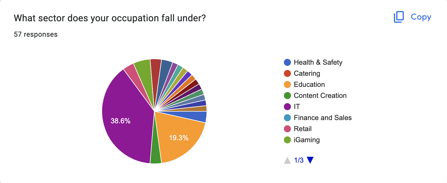
Public Survey:
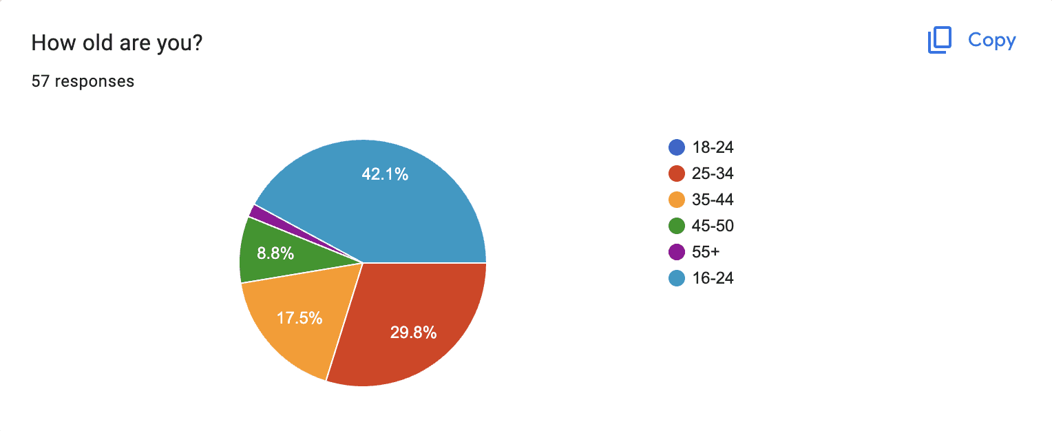
Participants: 57 individuals, aged 18 and above.
Outcome: Some results were inconclusive due to lack of control over responses.
Prototype Testing:
Participants: Eight individuals, including professional product designers, casual web users, and users with minimal online shopping experience.
Method: Conducted online to ensure safety and convenience.
Survey Tools and Limitations:
Google Forms: Used for both surveys despite limitations with image display.
Alternative Tools: SurveyMonkey, Survio, and Mailchimp were considered but had their own limitations.
Initial Survey:
Participants: Four experienced UX designers and a front-end manager specializing in e-commerce websites.
Method: Conducted among consenting colleagues.
Public Survey:
Participants: 57 individuals, aged 18 and above.
Outcome: Some results were inconclusive due to lack of control over responses.
Prototype Testing:
Participants: Eight individuals, including professional product designers, casual web users, and users with minimal online shopping experience.
Method: Conducted online to ensure safety and convenience.
Survey Tools and Limitations:
Google Forms: Used for both surveys despite limitations with image display.
Alternative Tools: SurveyMonkey, Survio, and Mailchimp were considered but had their own limitations.
Competitor / Market Analysis
Market analysis began after the first survey. Participants were asked to name their favorite websites to help understand their preferences and usage. This question was directed specifically at professional designers and developers to gain more insightful answers. Non-professionals might not provide the best insights for analysis.
Survey Results:
The most commonly mentioned website was Amazon.
Other notable mentions included AliExpress and a local site, Popp.
Analysis Approach:
Each website mentioned was thoroughly explored.
Notes were taken based on participants' feedback and online articles.
Common elements across these websites were identified.
The psychological tactics used by popular websites to engage and tempt users into purchases, even those they don't necessarily need, were observed.
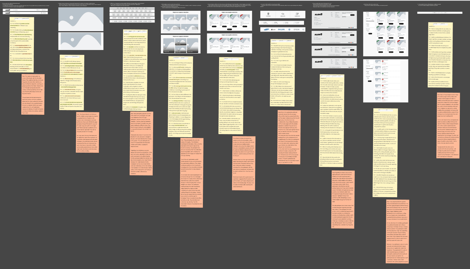
Interviews
Interviews were conducted at the very end of the project, where I asked a small group of participants to choose their preferred component, mostly for the homepage, since it contained most of the variants. More information about the variations can be found in the design chapter. Through the interviews, I gained a better understanding of what users like and their reasoning, as I could ask follow-up questions if needed.
Interviews were conducted at the very end of the project, where I asked a small group of participants to choose their preferred component, mostly for the homepage, since it contained most of the variants. More information about the variations can be found in the design chapter. Through the interviews, I gained a better understanding of what users like and their reasoning, as I could ask follow-up questions if needed.
Defintion
User Personas
Since I kept the responses generic, no actual user personas were formed, hence the stickies (that can be seen in the next section) that highlight everyone's comments.
Since I kept the responses generic, no actual user personas were formed, hence the stickies (that can be seen in the next section) that highlight everyone's comments.
Data Formulation
1st Survey : Thematic analysis in spreadsheets
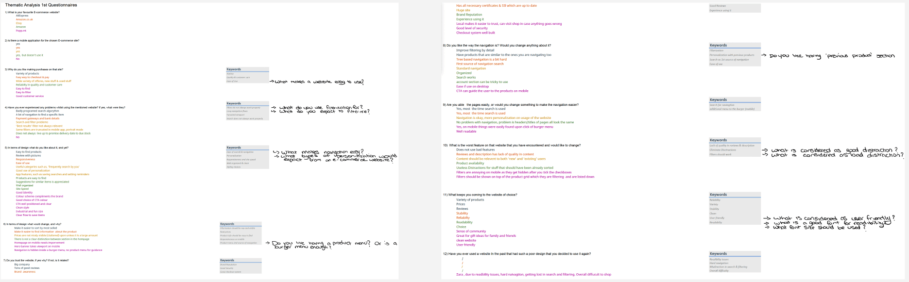
2nd Survey : Analyzed in figma

3rd Interview : Analyzed in figma
Design
Low-Fidelity
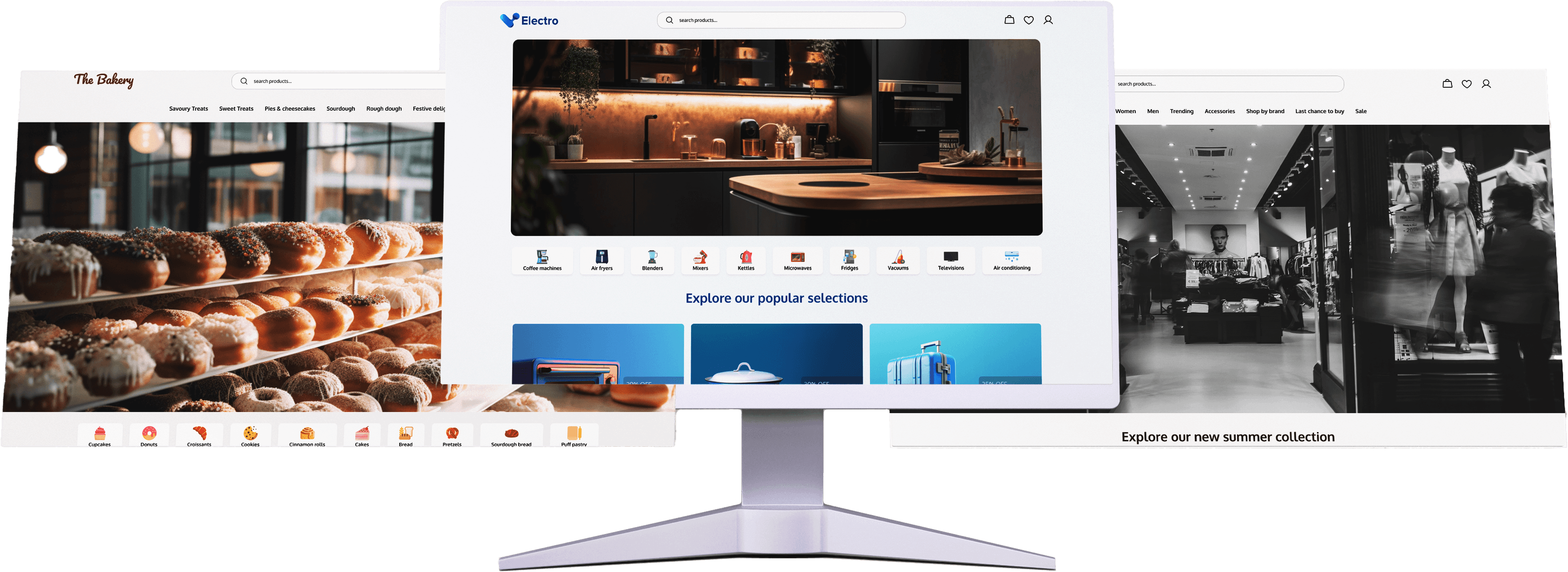
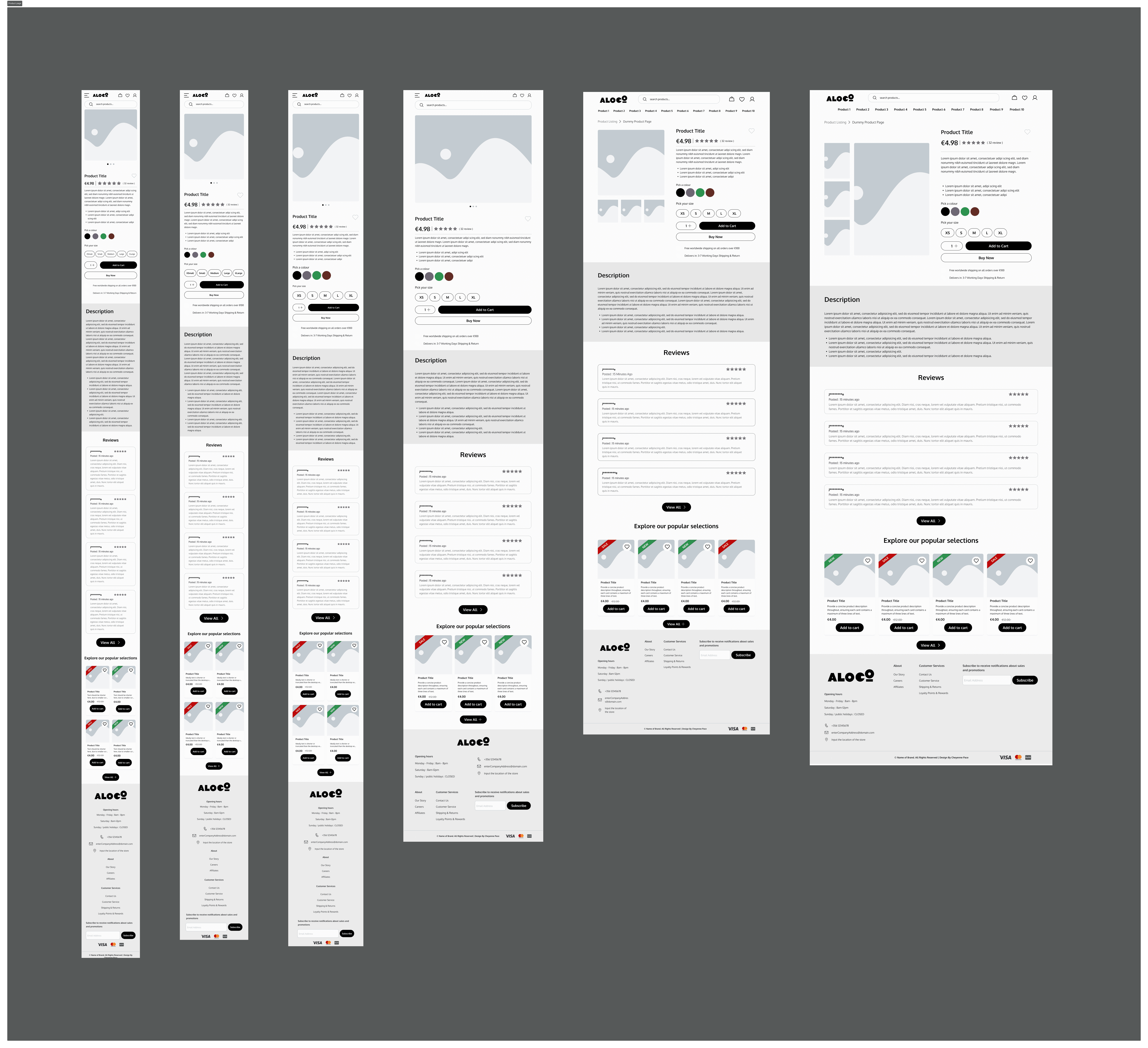
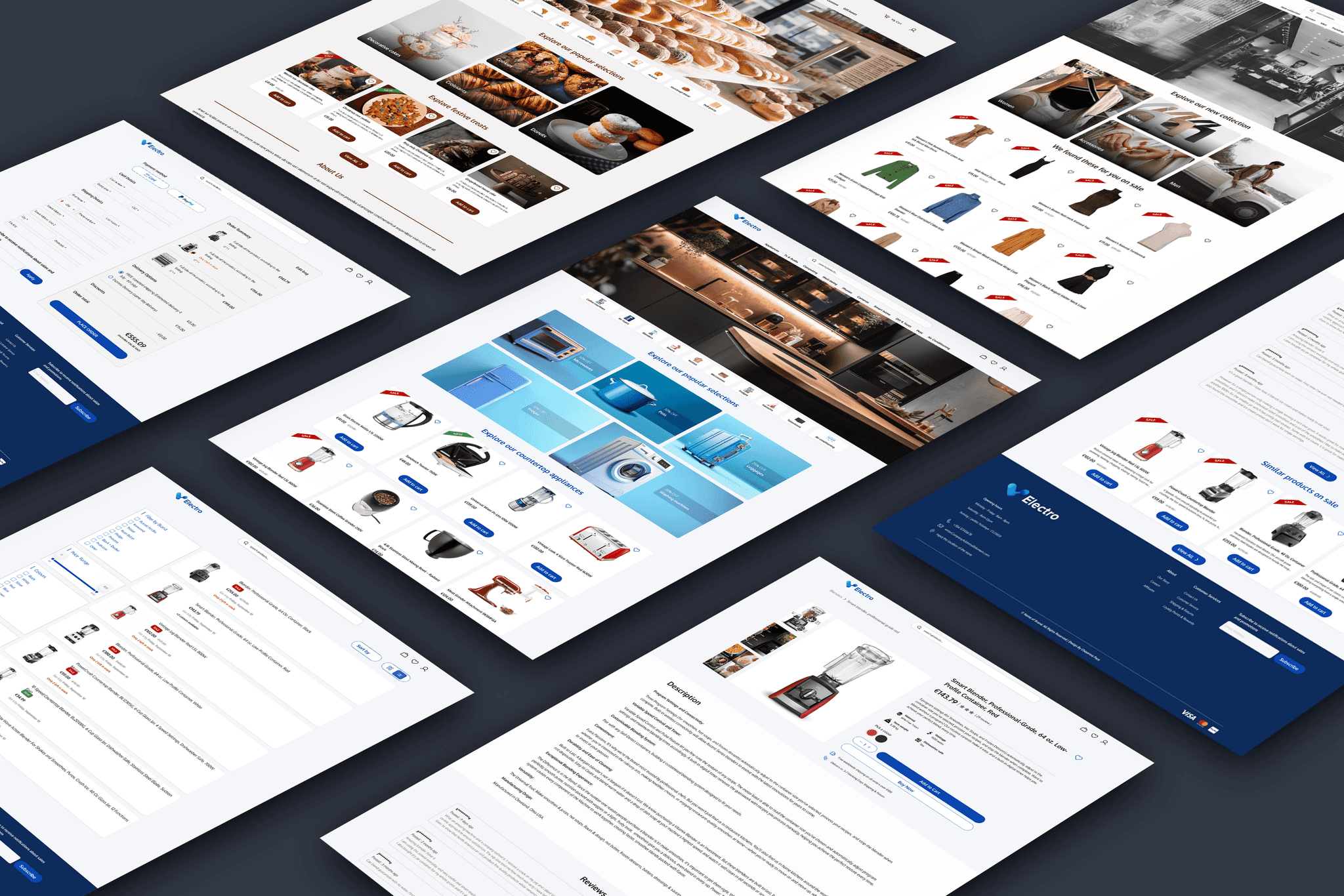
Below is an inside look at how the pages are structured. The actual template includes every page needed for a fully functional e-commerce website, such as the accounts page, the tracking information page, and the login/register page. All pages were designed based on responses from the second survey. Two of these pages, along with their variations, were tested during the final interview.
Below is an inside look at how the pages are structured. The actual template includes every page needed for a fully functional e-commerce website, such as the accounts page, the tracking information page, and the login/register page. All pages were designed based on responses from the second survey. Two of these pages, along with their variations, were tested during the final interview.

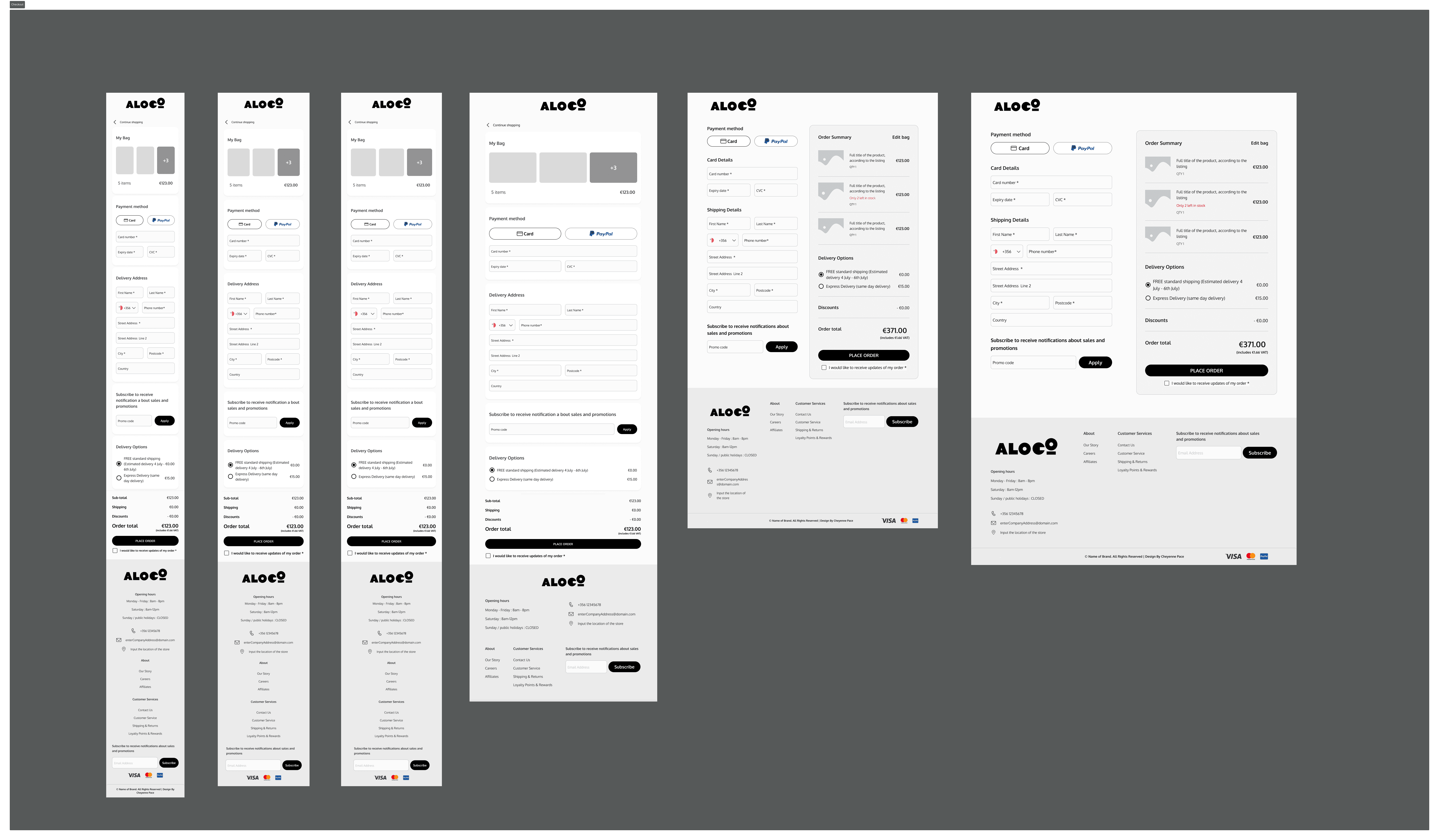
To change the variations of the components displayed on the pages, such as the homepage, simply select the component.
To change the variations of the components displayed on the pages, such as the homepage, simply select the component.
Navigate to the panel on the right hand side of Figma
Navigate to the panel on the right hand side of Figma
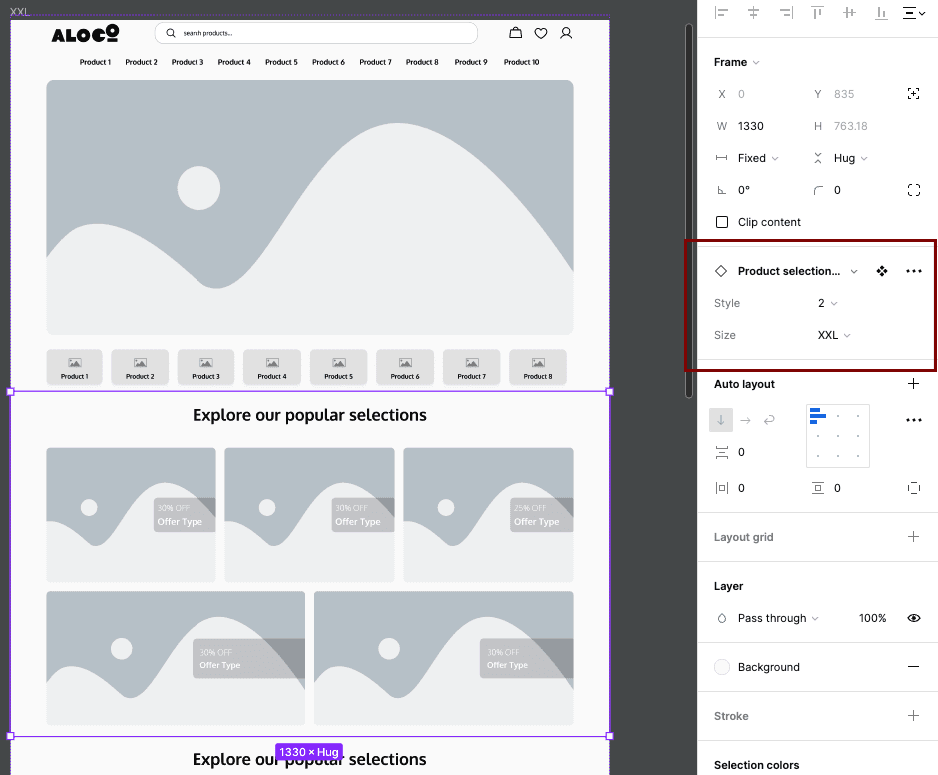
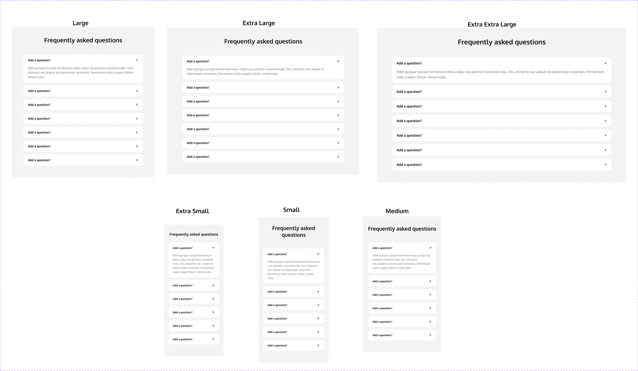
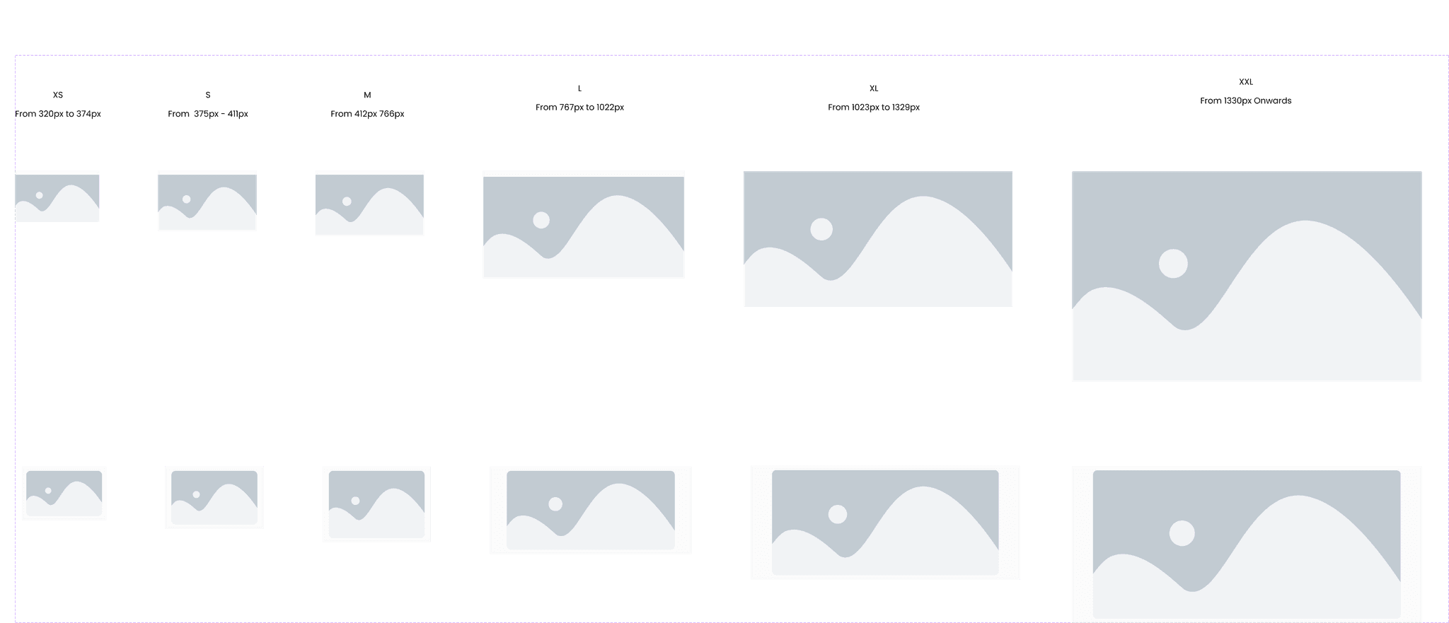
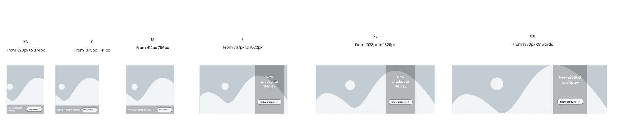
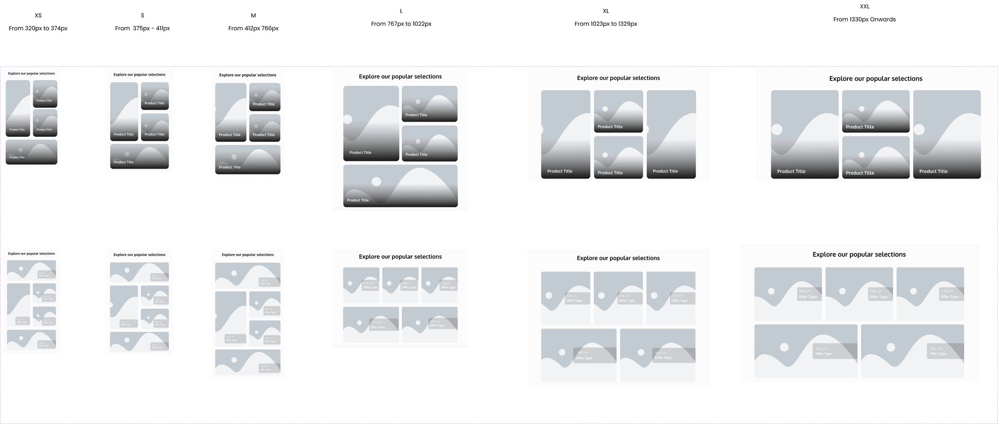
From the panel, one can simply change the variation from the drop down menu. Every variation include the 'Size', which is referring to the breakpoints, whether it is going to be for small mobile device, all the way to big desktops, which is what the current selection is, 'XXL'. The style in this case is between 1 and 2.
From the panel, one can simply change the variation from the drop down menu. Every variation include the 'Size', which is referring to the breakpoints, whether it is going to be for small mobile device, all the way to big desktops, which is what the current selection is, 'XXL'. The style in this case is between 1 and 2.
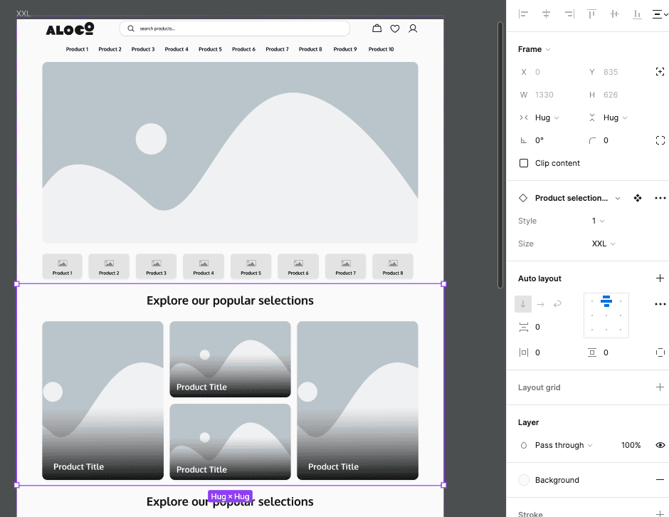
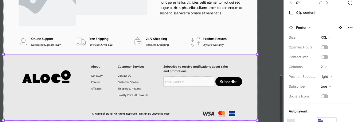
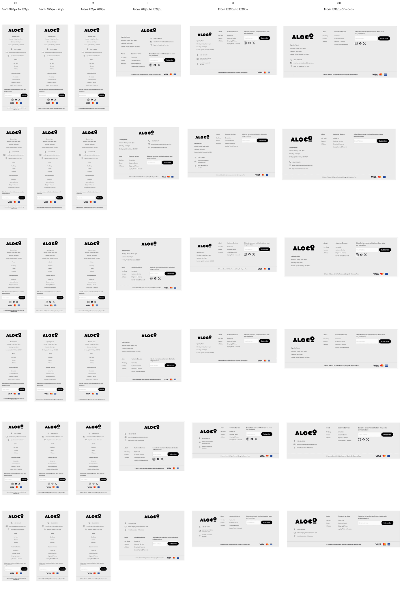
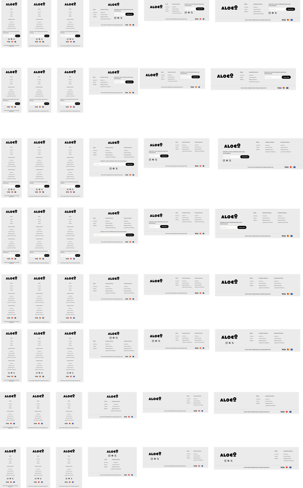
Other components can include more specific information, such as the footer. The footer has a total of 84 variations that one can utilize. Each variation is adaptable; if the user selects a certain variation from the right panel, the entire website will adapt accordingly. Below are a few examples to visually explain better.
Other components can include more specific information, such as the footer. The footer has a total of 84 variations that one can utilize. Each variation is adaptable; if the user selects a certain variation from the right panel, the entire website will adapt accordingly. Below are a few examples to visually explain better.

Branding
Branding will depend on who is making use of the template. This template can fully adapt to every company by simply changing the colours from the 'Local Styles'
Branding will depend on who is making use of the template. This template can fully adapt to every company by simply changing the colours from the 'Local Styles'

Hi-Fidelity
Usability Testing
Header
2) Do you use the favourites feature?
3) Do you having the like feature or do you add straight to cart?
Banner
1) Which version of the banner do you prefer having, the full version or the smaller rounded version.
2) Would you rather have a smaller banner and view some of the items in the store that are new, on sale or popular?
3) Does it make a difference? Does it depend on the items you are looking for?
Navigation
2) What are your thoughts on having both the regular menu, and the product menu underneath?
3) What are your thoughts on the arrow slider assist?
Product gallery
1) Which gallery would you prefer having and why?
2) Do you think having a small preview of the products on sale or popular is useful? or would you go straight to the search and look for the items you need?
3) Do you usually browse the homepage for offers/ or new items?
Uniques Selling Propositions
1) Do you know what USPs are?
2) Do you find USPs useful? or do you skip past them?
3) Would you rather know the stores popular brands or what they offer? Or find a way to display both in different sections?
Footer
1) Do you usually take notice of the footer? Or use it?
2) Would you find having the opening hours useful?
3) Do you make use of the subscription service for promotional messages?
4) Would you make use of social links or are they redundant?
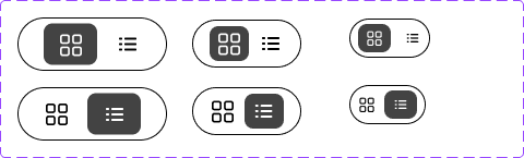
Grid switcher
1) Would you rather have a grid or a list?
2) Can you switch the layout of the grid?
3) Do you find the switcher understandable, and would you use it?
Pagination
1) Do your prefer having numbered pages or endless scrolling?
2) Do you find numbered pages convenient to go back?
Header
2) Do you use the favourites feature?
3) Do you having the like feature or do you add straight to cart?
Banner
1) Which version of the banner do you prefer having, the full version or the smaller rounded version.
2) Would you rather have a smaller banner and view some of the items in the store that are new, on sale or popular?
3) Does it make a difference? Does it depend on the items you are looking for?
Navigation
2) What are your thoughts on having both the regular menu, and the product menu underneath?
3) What are your thoughts on the arrow slider assist?
Product gallery
1) Which gallery would you prefer having and why?
2) Do you think having a small preview of the products on sale or popular is useful? or would you go straight to the search and look for the items you need?
3) Do you usually browse the homepage for offers/ or new items?
Uniques Selling Propositions
1) Do you know what USPs are?
2) Do you find USPs useful? or do you skip past them?
3) Would you rather know the stores popular brands or what they offer? Or find a way to display both in different sections?
Footer
1) Do you usually take notice of the footer? Or use it?
2) Would you find having the opening hours useful?
3) Do you make use of the subscription service for promotional messages?
4) Would you make use of social links or are they redundant?
Grid switcher
1) Would you rather have a grid or a list?
2) Can you switch the layout of the grid?
3) Do you find the switcher understandable, and would you use it?
Pagination
1) Do your prefer having numbered pages or endless scrolling?
2) Do you find numbered pages convenient to go back?
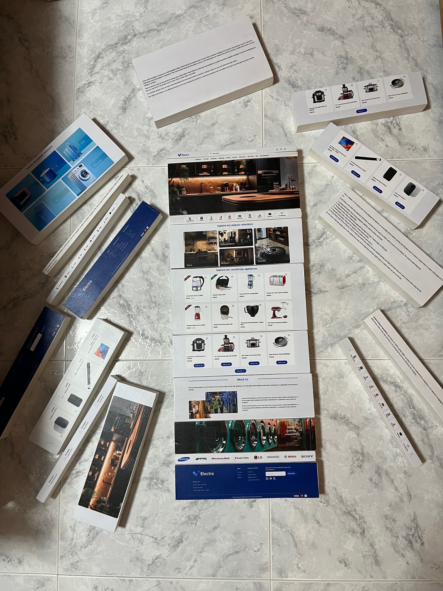
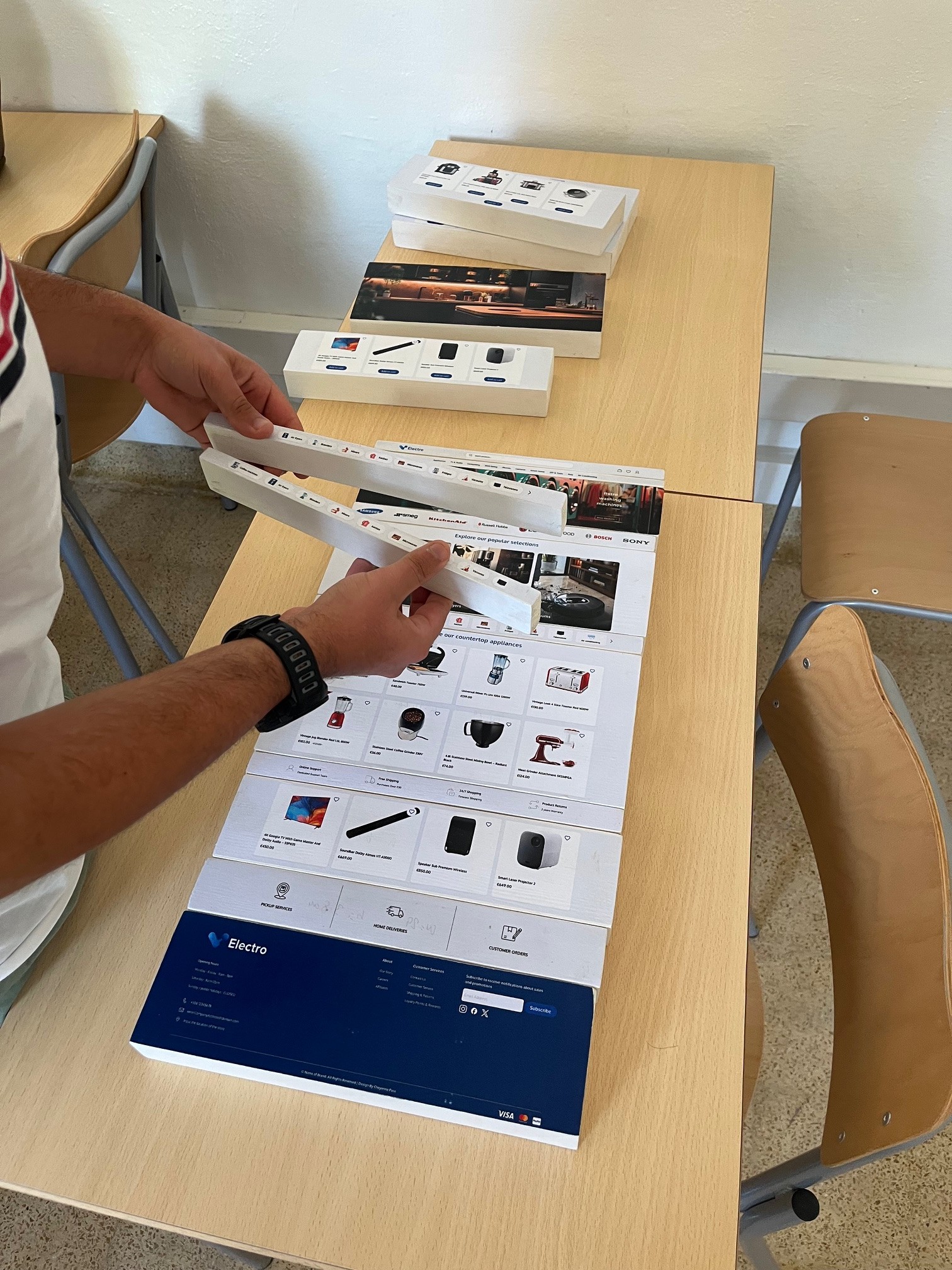
More testing will be done in the future, where the participants will be given the chance to build a website physically not on software. for this to be possible the researcher printed and made wooden blocks which represent each component in the homepage. From this she will a
More testing will be done in the future, where participants will have the chance to build a website physically rather than using software. To make this possible, the researcher has printed and made wooden blocks representing each component of the homepage. She will ask users to build the website based on how they think it should be. Although the data retrieved will be mostly personalized, she aims to find a pattern to analyze and compare with the testing done online via Figma prototyping. The wooden blocks also serve as an educational tool for viewers who are not familiar with web design, allowing them to learn and gain hands-on experience.
More testing will be done in the future, where participants will have the chance to build a website physically rather than using software. To make this possible, the researcher has printed and made wooden blocks representing each component of the homepage. She will ask users to build the website based on how they think it should be. Although the data retrieved will be mostly personalized, she aims to find a pattern to analyze and compare with the testing done online via Figma prototyping. The wooden blocks also serve as an educational tool for viewers who are not familiar with web design, allowing them to learn and gain hands-on experience.
Components
Accordion
The accordion is a component that reveals or hides associated sections of content. In the accordions, text can be adaptable, and images and animations can be added.
The accordion is a component that reveals or hides associated sections of content. In the accordions, text can be adaptable, and images and animations can be added.
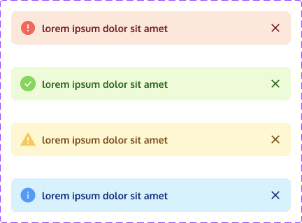
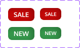
Alerts
Alerts are interactive elements that convey important information, warnings, or notifications to grab attention, provide feedback, and prompt specific actions or informed decisions.
Alerts are interactive elements that convey important information, warnings, or notifications to grab attention, provide feedback, and prompt specific actions or informed decisions.
Banner
This is the main banner. It might have important information like the website's name or logo, special promotions or deals, or maybe even a message welcoming visitors to the site. It's one of the first things the customer sees when they visit a webpage, and it's there to grab their attention and give you key information about the website or what's going on. Think of it as the website's way of saying, "Hey, check this out!
This is the main banner. It might have important information like the website's name or logo, special promotions or deals, or maybe even a message welcoming visitors to the site. It's one of the first things the customer sees when they visit a webpage, and it's there to grab their attention and give you key information about the website or what's going on. Think of it as the website's way of saying, "Hey, check this out!
This is the secondary banner. This version of the banner can be used to highlight promotions, discounts, or advertisements for products, services, or upcoming events. This space provides visibility for important information without overwhelming the main content area.
Overall, the secondary banner is a versatile design element that can be used to enhance the user experience, promote key messages, and drive engagement on a website. Its specific use will depend on the goals and priorities of the website and its visitors.
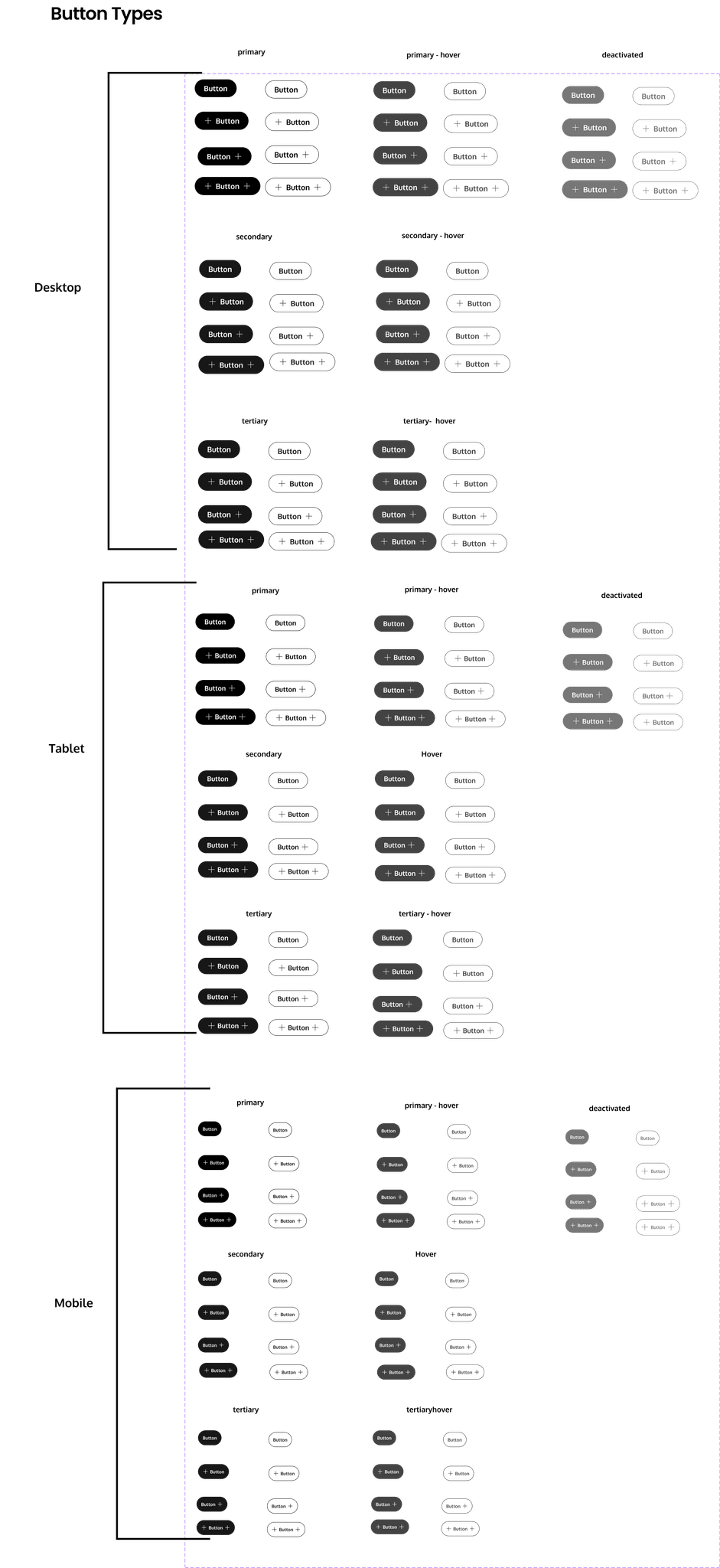
Buttons
The button component is essential for performing form or interaction events. To guide users effectively and achieve business or sales goals, different types of buttons (Primary, Secondary and Tertiary) are available. While a button can be used with or without a label, it is recommended to keep the label visible for better usability. If used without a visible label, providing a descriptive label text for screen readers is mandatory for accessibility. For navigational elements, use the Link component instead.
The button component is essential for performing form or interaction events. To guide users effectively and achieve business or sales goals, different types of buttons (Primary, Secondary and Tertiary) are available. While a button can be used with or without a label, it is recommended to keep the label visible for better usability. If used without a visible label, providing a descriptive label text for screen readers is mandatory for accessibility. For navigational elements, use the Link component instead.
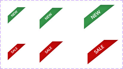
Cards
Those neat rectangles or squares are called product cards. They're like little preview boxes for items that a website is selling. Each product card typically contains important information about the product it represents. This could include things like the product name, a brief description, an image of the product, its price, maybe even some customer ratings or reviews.
Those neat rectangles or squares are called product cards. They're like little preview boxes for items that a website is selling. Each product card typically contains important information about the product it represents. This could include things like the product name, a brief description, an image of the product, its price, maybe even some customer ratings or reviews.
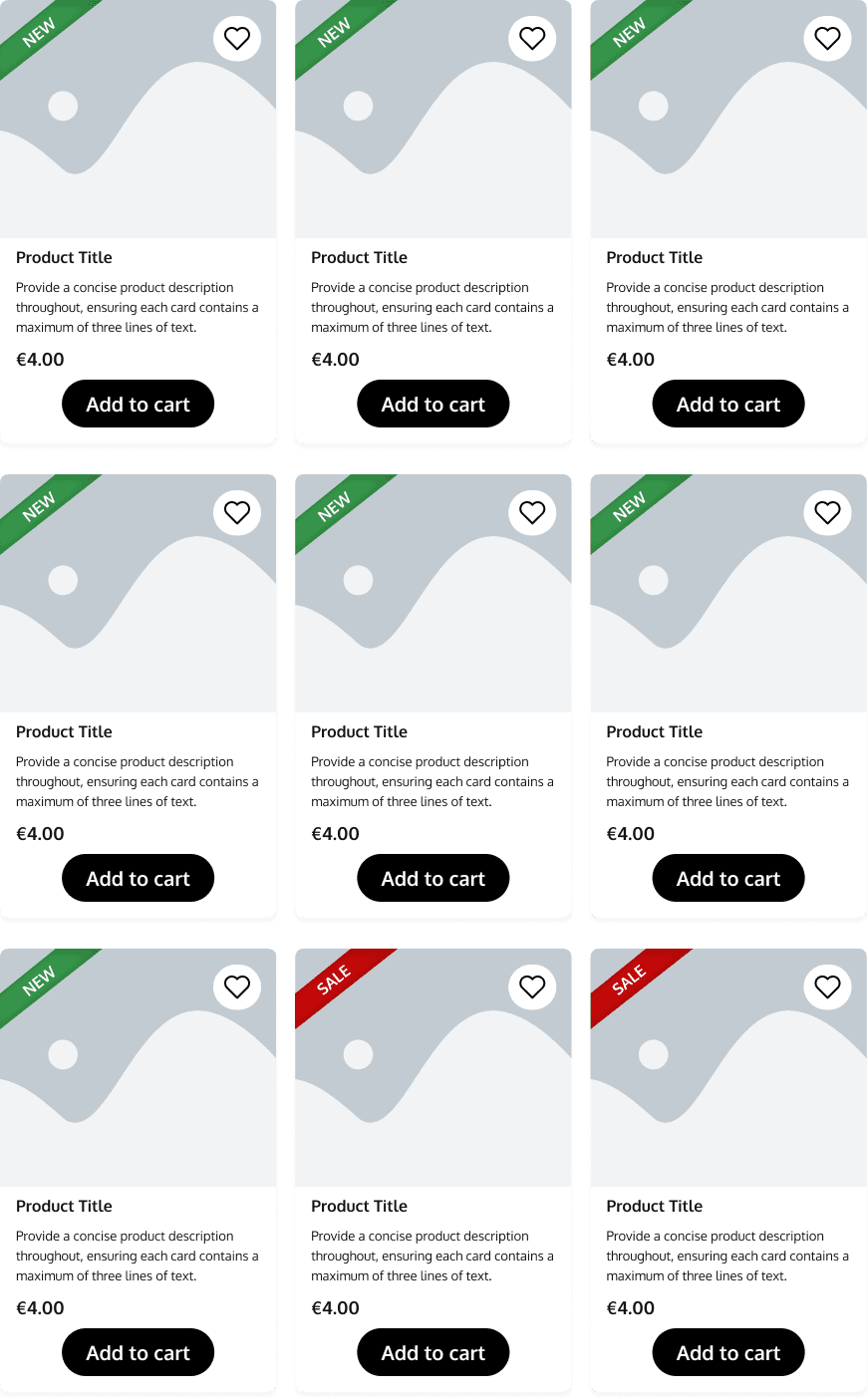
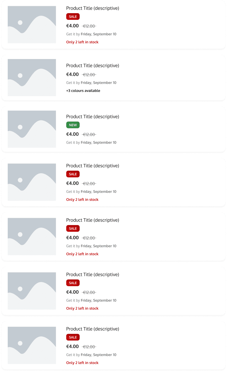
This is a product gallery. These cards can be styled and grouped together to showcase the products in a more interesting way. These types of cards can be used to display new products or items on sale.
Its primary purpose is to serve as a promotional space, leveraging insights from user research indicating that customers are drawn to homepages offering enticing deals and captivating content. By integrating additional promotional sections, user engagement is increased, motivating visitors to delve deeper into our offerings and ultimately drive higher conversion rates.
Checkbox
The checkbox is an interactive element that allows users to select one or more options from a set. It typically appears as a small square box that can be checked (selected) or unchecked (deselected). Checkboxes are often used in forms, settings, and lists to enable users to make multiple selections or toggle features on and off.
The checkbox is an interactive element that allows users to select one or more options from a set. It typically appears as a small square box that can be checked (selected) or unchecked (deselected). Checkboxes are often used in forms, settings, and lists to enable users to make multiple selections or toggle features on and off.

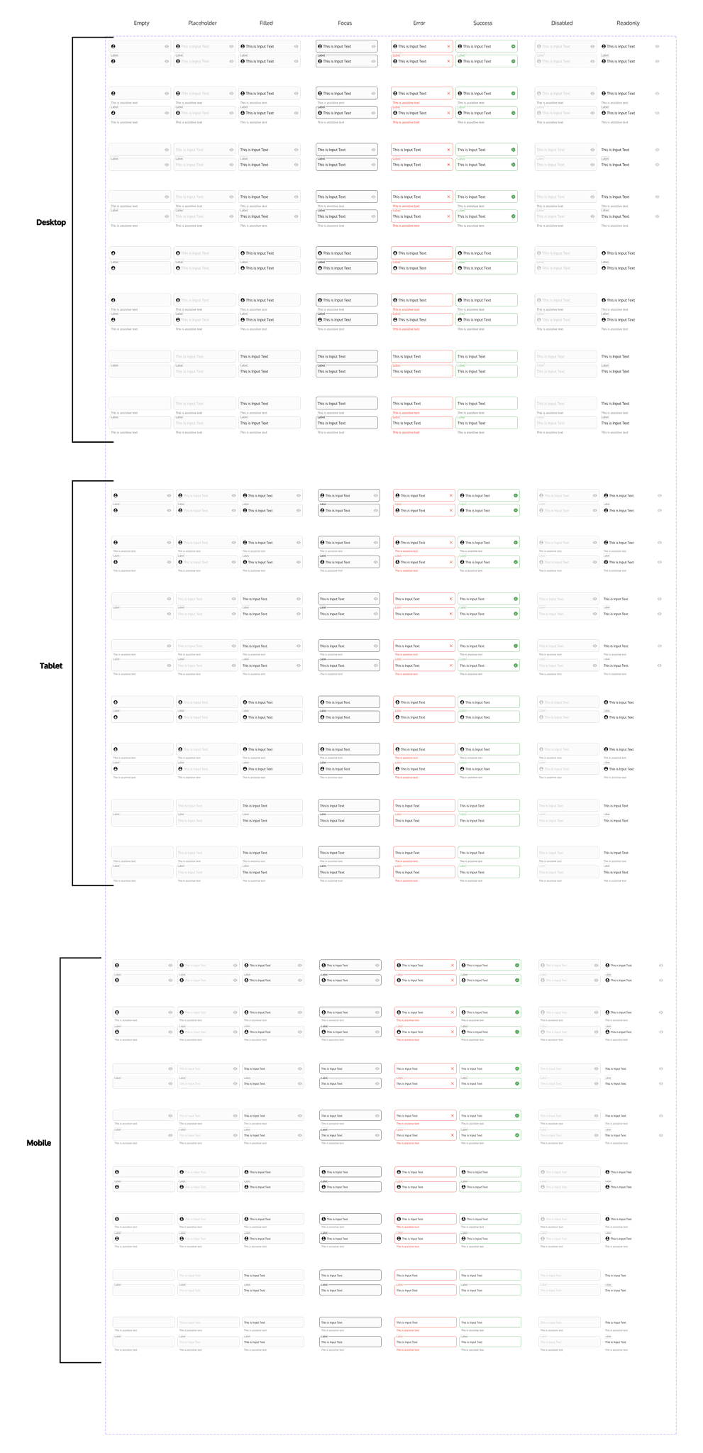
Fieldset
Text fields are interactive elements where users can input text. It is commonly used in forms, search bars, and data entry interfaces. Text fields can accept various types of input, such as single-line text, multi-line text, passwords, and email addresses. They often include features like placeholders, labels, and validation messages to guide users and ensure accurate data entry.
Text fields are interactive elements where users can input text. It is commonly used in forms, search bars, and data entry interfaces. Text fields can accept various types of input, such as single-line text, multi-line text, passwords, and email addresses. They often include features like placeholders, labels, and validation messages to guide users and ensure accurate data entry.
Footer
This is a footer. It's the bottom part of the webpage that appears on every page of the website, just like how the back cover of a book is always there no matter which page you're on.
In the footer, you'll often find important information and links that are useful no matter where you are on the website. This could include things like :
- Contact Information: Such as the company's address, phone number, and email.
- Store opening hours ( if applicable)
- Navigation Links: Links to important pages like the About Us page, Contact page, or FAQ page.
- Social Media Icons: Links to the company's social media profiles.
- Copyright Information: The year the website was created and who owns it.
- Privacy Policy and Terms of Service: Links to legal documents etc
Icons
Icons refer to the use and style of icons to convey information, actions, and feedback visually. Icons are simplified images or symbols that represent objects, functions, or concepts.
Icons refer to the use and style of icons to convey information, actions, and feedback visually. Icons are simplified images or symbols that represent objects, functions, or concepts.
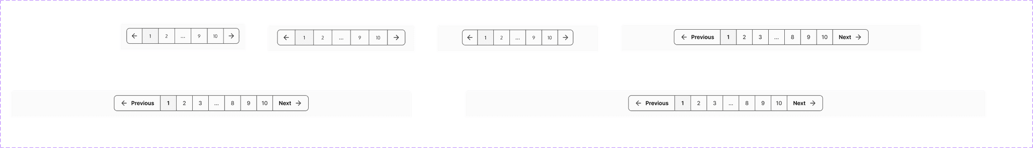
Pagination
Pagination can be used to navigate from one page to another on the products page. One can also opt for endless scrolling.
Pagination can be used to navigate from one page to another on the products page. One can also opt for endless scrolling.
Radio Buttons
The singular property of a radio button makes it distinct from a checkbox, which allows more than one item to be selected and can be restored to an unselected state.
The singular property of a radio button makes it distinct from a checkbox, which allows more than one item to be selected and can be restored to an unselected state.

Switch
A switch is a control used to quickly switch between two possible states. A switch is used exclusively for binary actions that occur immediately after the user flips it. It is commonly used for an 'on/off' state
A switch is a control used to quickly switch between two possible states. A switch is used exclusively for binary actions that occur immediately after the user flips it. It is commonly used for an 'on/off' state
Tag
Tage are used to label, categorize, or organize items by using keywords that describe them.
Tage are used to label, categorize, or organize items by using keywords that describe them.
Conclusion
Final Remarks
The main objective of this study was to highlight the importance of UX/UI principles in e-commerce website design and uncover consumers' preferences and frustrations when shopping online. To achieve this, surveys and interviews were conducted, leading to the creation of a highly customizable template for various users and brands. This template has been tested with customers and is fully accessible and flexible, even in terms of sizes.
Responsiveness was a major concern, so the template is fully responsive, catering to all device sizes from smartphones to extra-large desktops. It is adaptable to different brands, such as fashion, appliances, and food. These variations were tested and confirmed successful.
Users of the template will be guided by sticky notes describing important survey results and providing brief descriptions of each component and its use.
Some limitations were noted, with a few components lacking automatic responsiveness. These can still be adjusted manually. This issue mainly occurs on the homepage, which contains most of the variations.
Future Improvements
Finally, for future improvements, it is important to address the limitations previously mentioned. Additionally, there is a plan to continue in-depth research and further development of the template. After finalizing the template, including all confirmation screens, modal, pop-ups, etc., the intention is to allow consumers to make use of them.
Finally, for future improvements, it is important to address the limitations previously mentioned. Additionally, there is a plan to continue in-depth research and further development of the template. After finalizing the template, including all confirmation screens, modal, pop-ups, etc., the intention is to allow consumers to make use of them.