
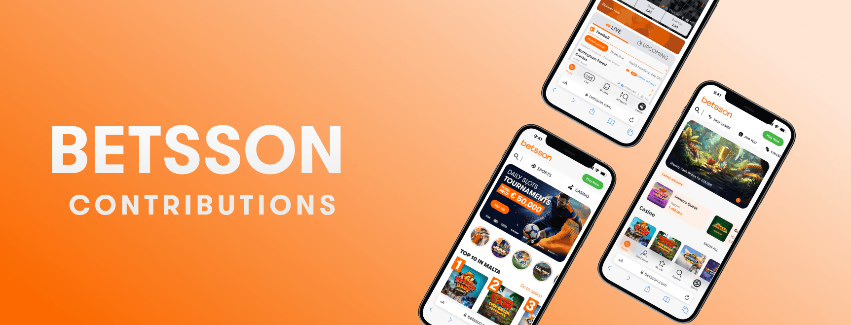
Betsson major contributions
Betsson major contributions
During my time at Betsson, I led key initiatives that improved the platform’s navigation and layout, beginning with my internship. I worked on addressing inconsistencies in the homepage, casino lobby, and sports lobby, improving the user experience by aligning structures and introducing a consistent search functionality. Additionally, I initiated the homepage redesign by proposing modern updates, such as transitioning to a white header and introducing dark mode, which enhanced the overall design and gamification experience.
During my time at Betsson, I led key initiatives that improved the platform’s navigation and layout, beginning with my internship. I worked on addressing inconsistencies in the homepage, casino lobby, and sports lobby, improving the user experience by aligning structures and introducing a consistent search functionality. Additionally, I initiated the homepage redesign by proposing modern updates, such as transitioning to a white header and introducing dark mode, which enhanced the overall design and gamification experience.
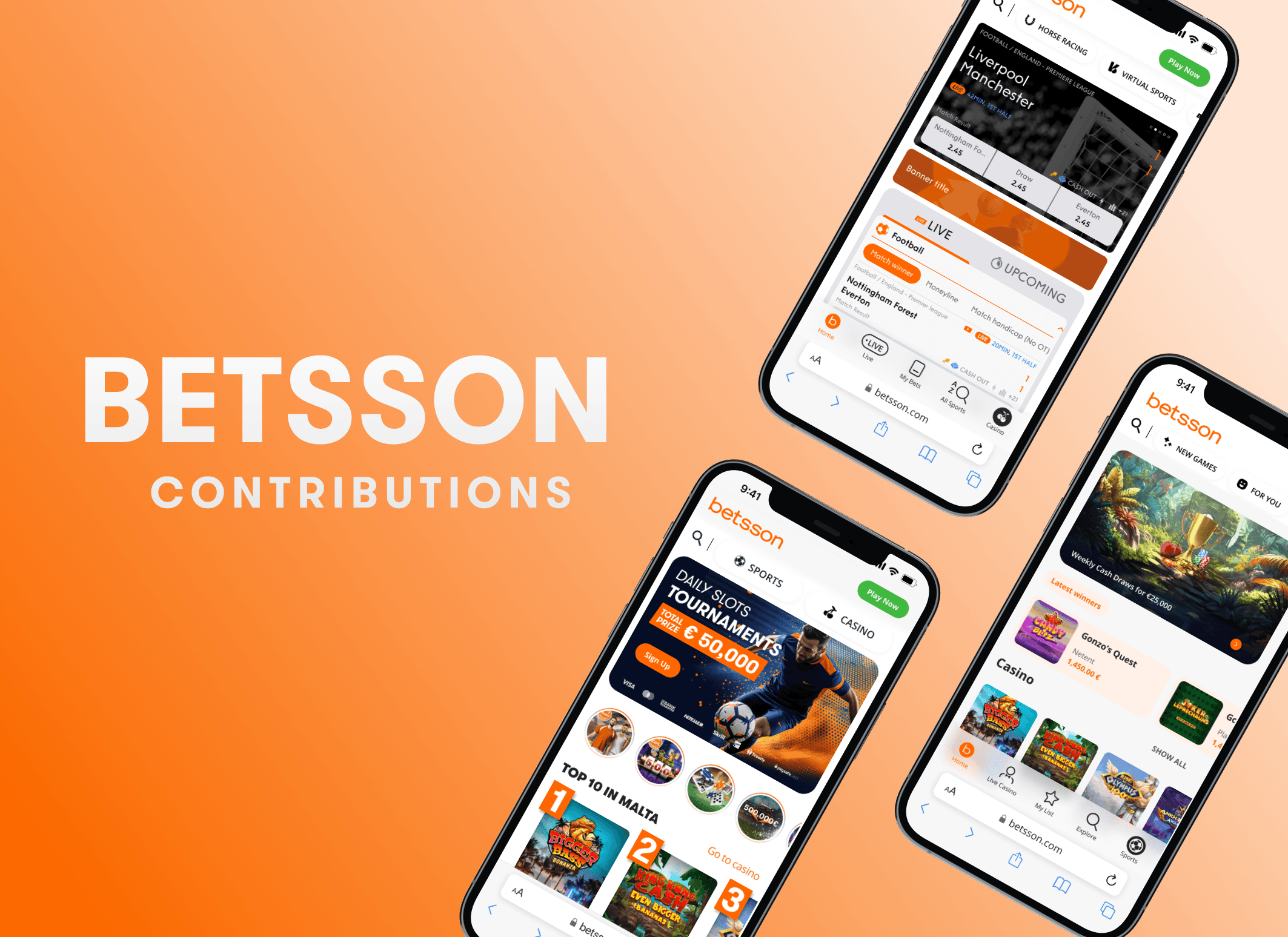
Navigation 2.0
Navigation 2.0
Background
Background
I contributed to several key initiatives that accelerated my professional growth and deepened my understanding of the company’s business structure and navigation systems. One of the most significant projects I was involved in began during my internship.
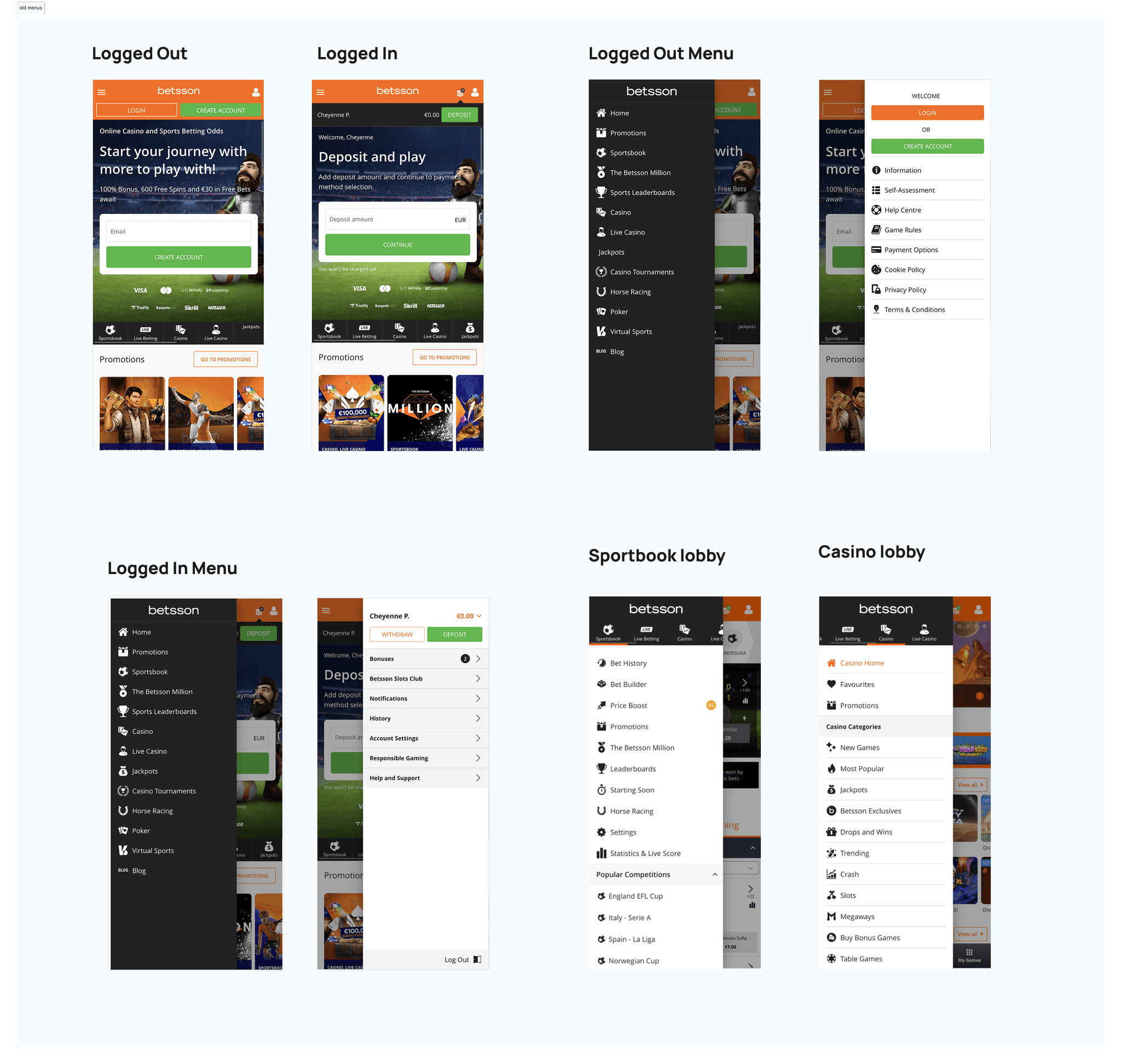
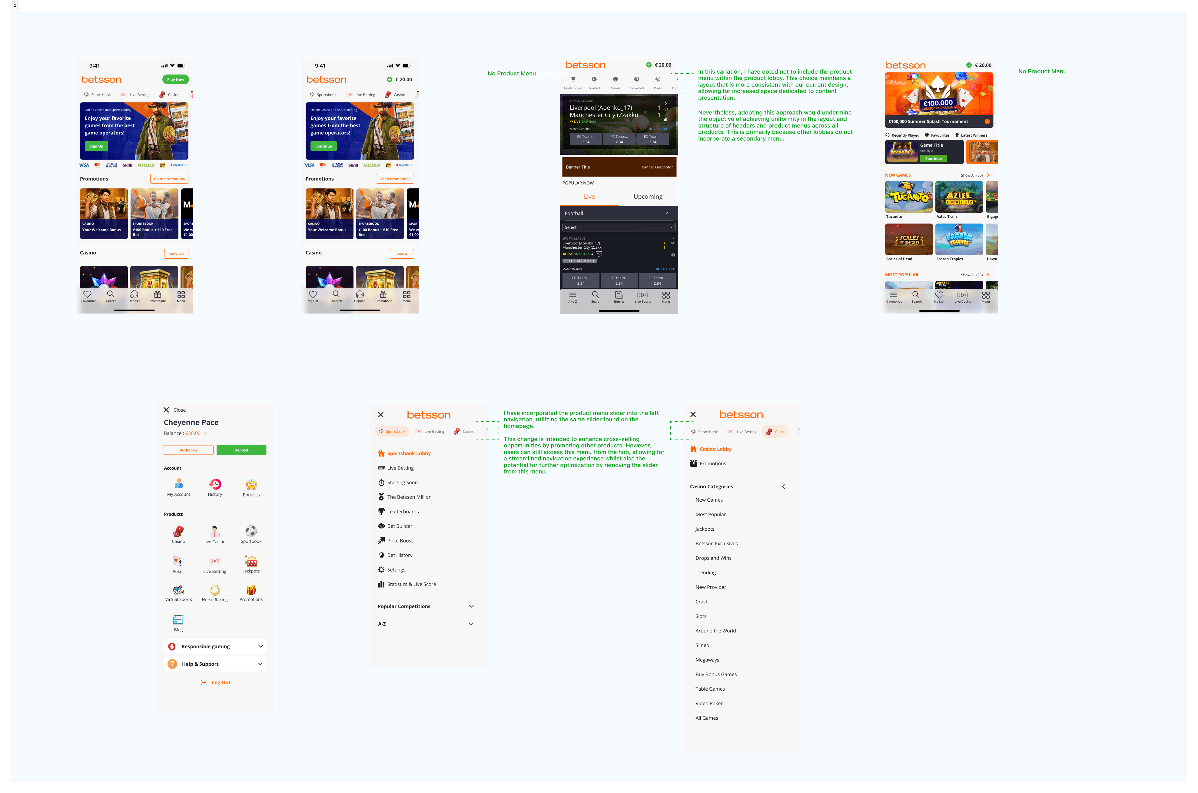
I interned at Betsson for two years while completing my studies, and after the first year, I had the opportunity to work on the navigation structure. This project revealed additional issues with the layout, prompting further research. Our investigation uncovered problems in the homepage layout, labeling inconsistencies, redundancy, and search filtration inefficiencies.
These inconsistencies between the homepage, casino lobby, and sports lobby led to user frustrations. For example, during user research interviews, participants were unable to find the search icon on the homepage because it wasn’t available there. When asked to navigate to the casino lobby and use the search functionality, many found this simple task challenging. Most users overlooked the header changes and assumed that since the search wasn’t available on the homepage, it wouldn’t be present in the casino lobby either. This lack of consistency resulted in a poorer user experience and lower ratings.
My goal for this initiative was to streamline the navigation across all sections, including the homepage, and establish a consistent structure for the search bar, reducing confusion and improving usability.
Working on the Navigation 2.0 project also led to a homepage redesign. While improving the navigation, I encountered limitations with the existing design system, particularly with the outdated components and the orange header, which made it difficult to modernize the layout. After spending considerable time trying to make the designs work within these constraints, I began proposing design changes.
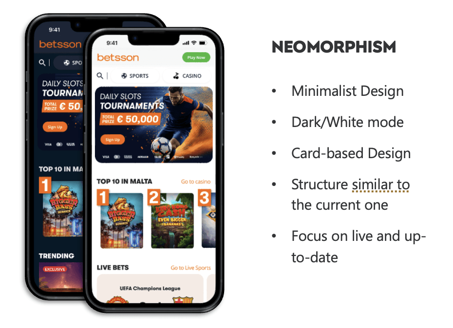
One of my first suggestions was switching from an orange to a white header and introducing dark mode, which significantly enhanced the user experience, especially in terms of gamification. These changes were well-received by stakeholders, and by the end of the year, a full homepage redesign initiative was underway.
I contributed to several key initiatives that accelerated my professional growth and deepened my understanding of the company’s business structure and navigation systems. One of the most significant projects I was involved in began during my internship.
I interned at Betsson for two years while completing my studies, and after the first year, I had the opportunity to work on the navigation structure. This project revealed additional issues with the layout, prompting further research. Our investigation uncovered problems in the homepage layout, labeling inconsistencies, redundancy, and search filtration inefficiencies.
These inconsistencies between the homepage, casino lobby, and sports lobby led to user frustrations. For example, during user research interviews, participants were unable to find the search icon on the homepage because it wasn’t available there. When asked to navigate to the casino lobby and use the search functionality, many found this simple task challenging. Most users overlooked the header changes and assumed that since the search wasn’t available on the homepage, it wouldn’t be present in the casino lobby either. This lack of consistency resulted in a poorer user experience and lower ratings.
My goal for this initiative was to streamline the navigation across all sections, including the homepage, and establish a consistent structure for the search bar, reducing confusion and improving usability.\
Working on the Navigation 2.0 project also led to a homepage redesign. While improving the navigation, I encountered limitations with the existing design system, particularly with the outdated components and the orange header, which made it difficult to modernize the layout. After spending considerable time trying to make the designs work within these constraints, I began proposing design changes.
One of my first suggestions was switching from an orange to a white header and introducing dark mode, which significantly enhanced the user experience, especially in terms of gamification. These changes were well-received by stakeholders, and by the end of the year, a full homepage redesign initiative was underway.
Goals
Goals
The goals of this initiative were to create a consistent navigation experience, reduce redundancy in our menus, and streamline cross-selling within our platform. During further brainstorming, I noticed that the primary colour was overpowering the overall look of our sites, making them appear outdated. After identifying this issue, improving the visual design also became one of our key objectives.
The goals of this initiative were to create a consistent navigation experience, reduce redundancy in our menus, and streamline cross-selling within our platform. During further brainstorming, I noticed that the primary colour was overpowering the overall look of our sites, making them appear outdated. After identifying this issue, improving the visual design also became one of our key objectives.
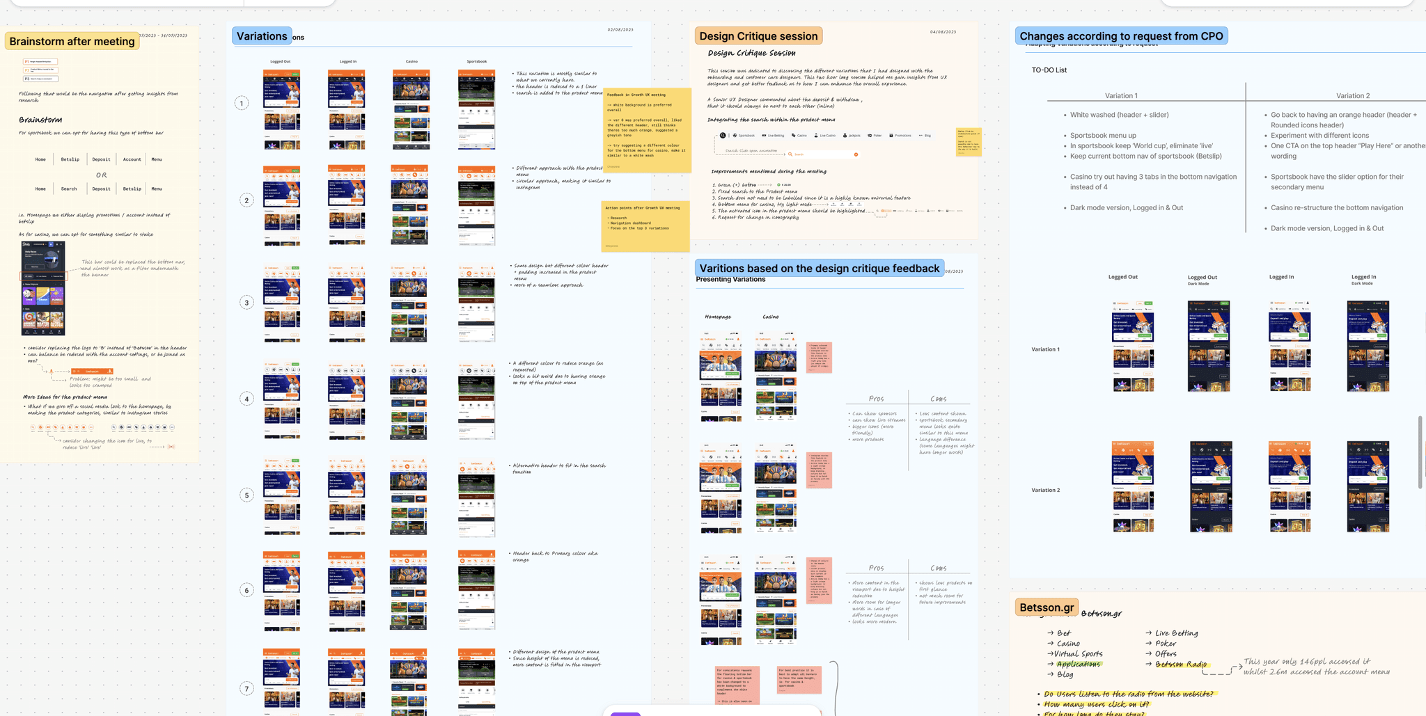
During this phase, I consolidated all necessary data in FigJam, documented every meeting, and captured feedback to continuously refine and improve our navigation design. I ensured active collaboration with designers, engineers, and architects to identify the root problems. Beyond design discussions, I focused on making decisions that would not significantly impact the architects while confirming that our system could support the new design.
In the screenshot below, you can see a very small preview of the documentation structure I followed and based my work on. This approach ultimately led to better outcomes through continuous refinement and improvement. Later, it served as a reference when the project was handed over to our central UX team.
Problems
Problems
During the investigation stage, I identified several issues:
Inconsistent menus across the site
The homepage, casino lobby, and sports lobby use different styling and contain redundancies—especially in the sports menu.Scattered navigation menus
Multiple menus appear in different sections of the pages, which can confuse users and make it harder for them to find what they need.Search functionality limitations
Search is only available within individual lobbies (gaming or sports), and the behaviour as well as the style differs between them.Unclear navigation patterns
Navigation depends on the page the user is on, with no consistent structure across the site.Outdated colour scheme
The design system relies heavily on the primary orange colour, which feels overpowering and makes the interface look cluttered and outdated.
Defintion
Defintion
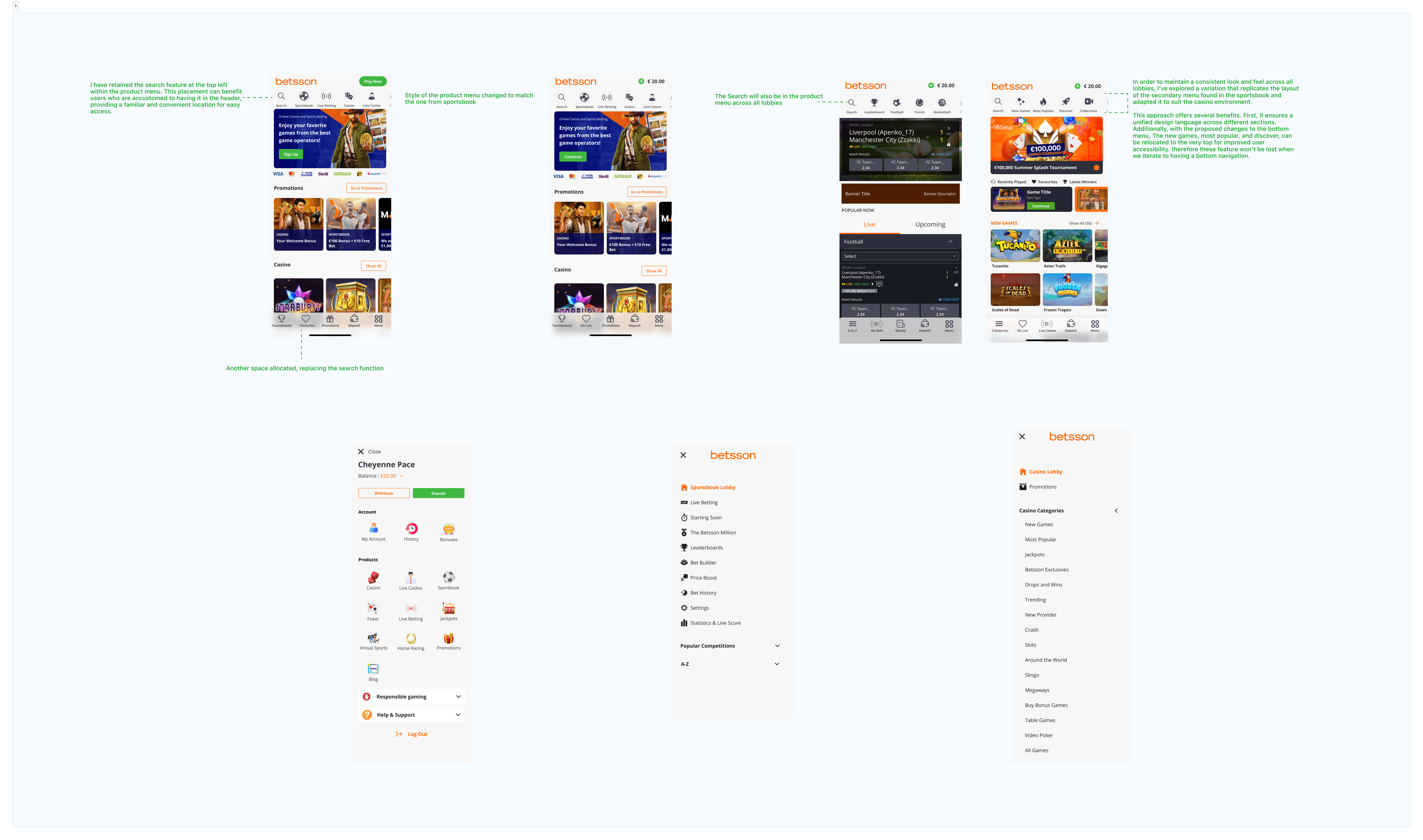
Data Formulation
Several variations leading to the final decision
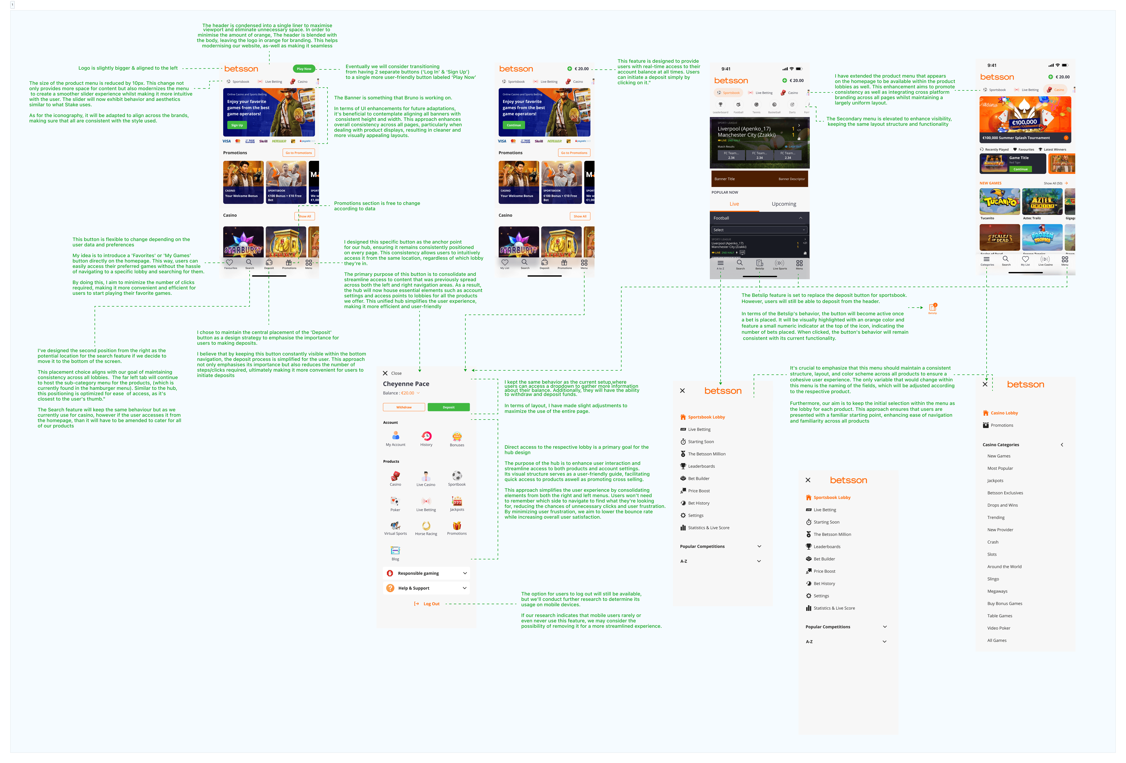
During this phase, I consolidated all necessary data in FigJam, documented every meeting, and captured feedback to continuously refine and improve our navigation design. I ensured active collaboration with designers, engineers, and architects to identify the root problems. Beyond design discussions, I focused on making decisions that would not significantly impact the architects while confirming that our system could support the new design.
In the screenshot below, you can see a very small preview of the documentation structure I followed and based my work on. This approach ultimately led to better outcomes through continuous refinement and improvement. Later, it served as a reference when the project was handed over to our central UX team.
Design
Design
Several variations leading to the final decision
Data Formulation
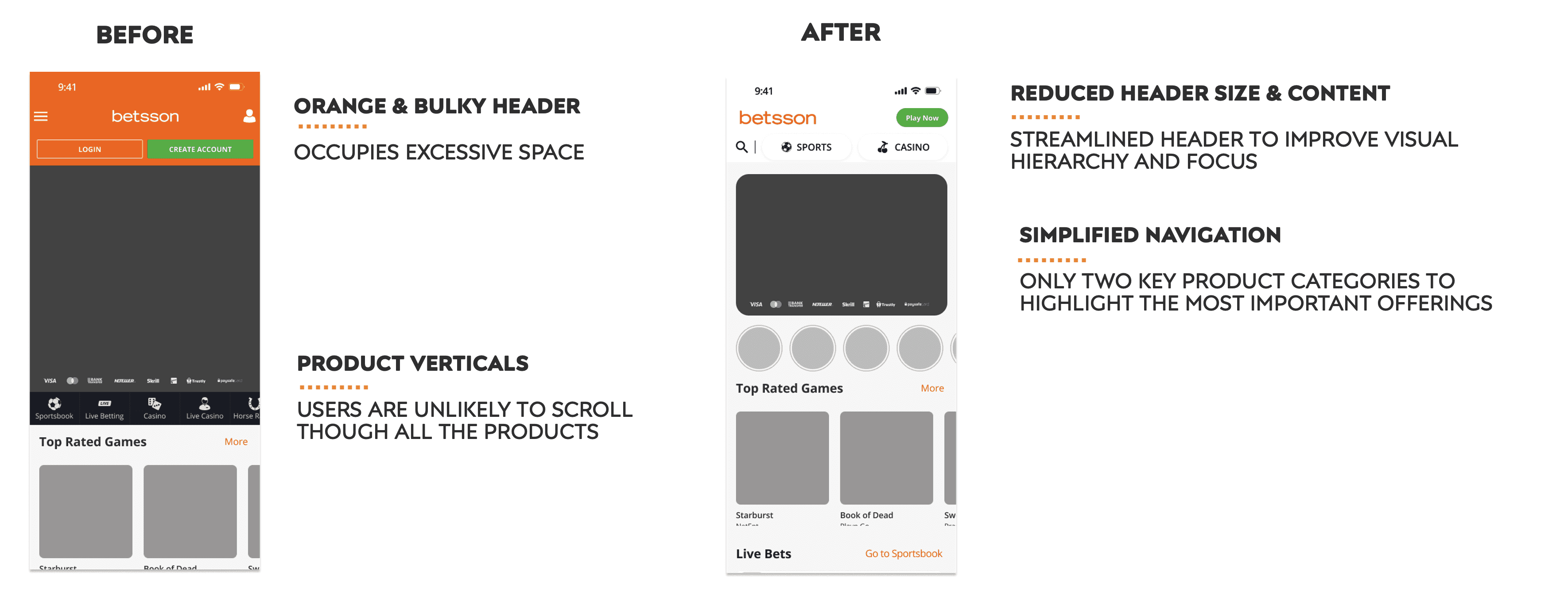
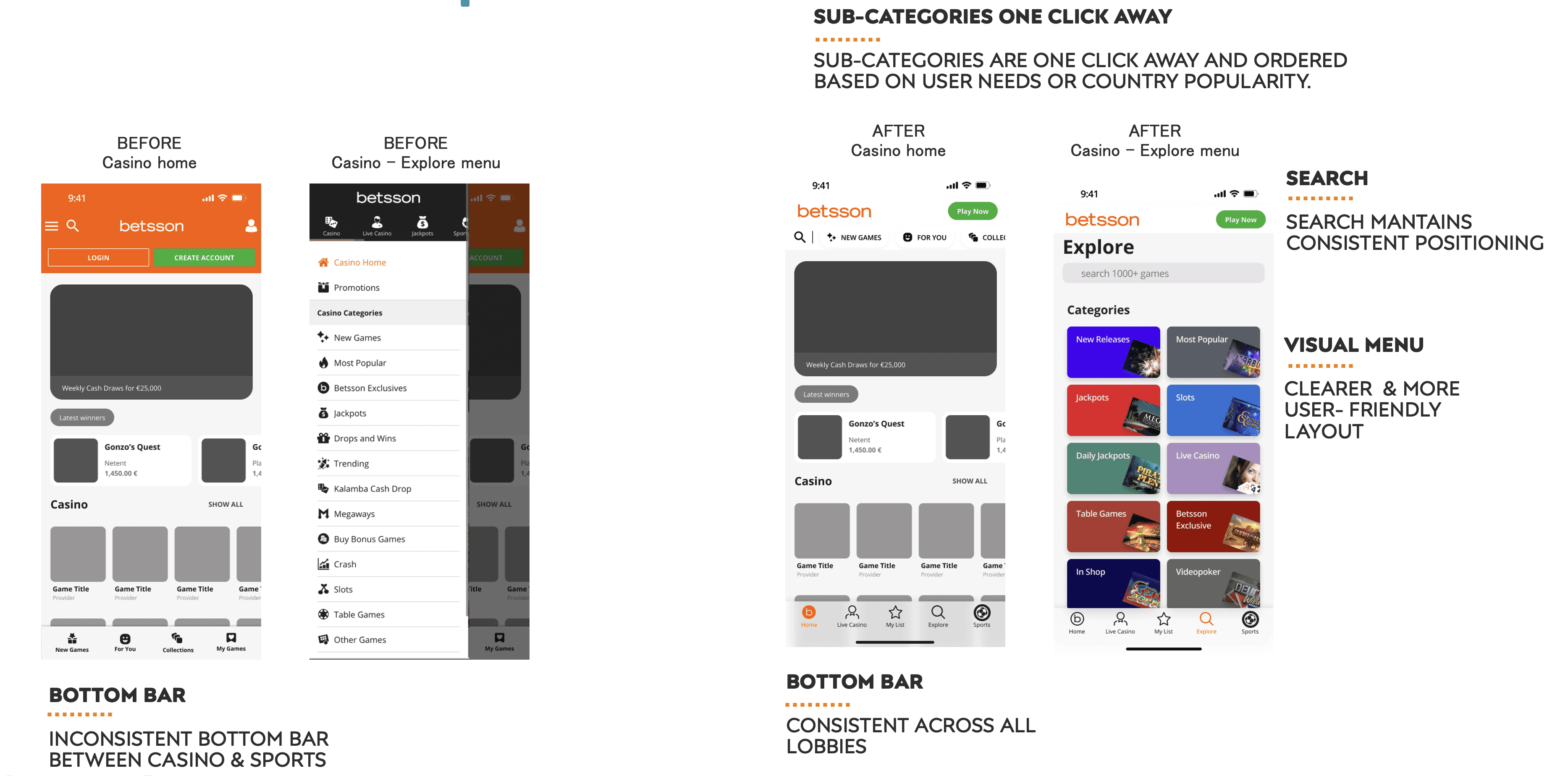
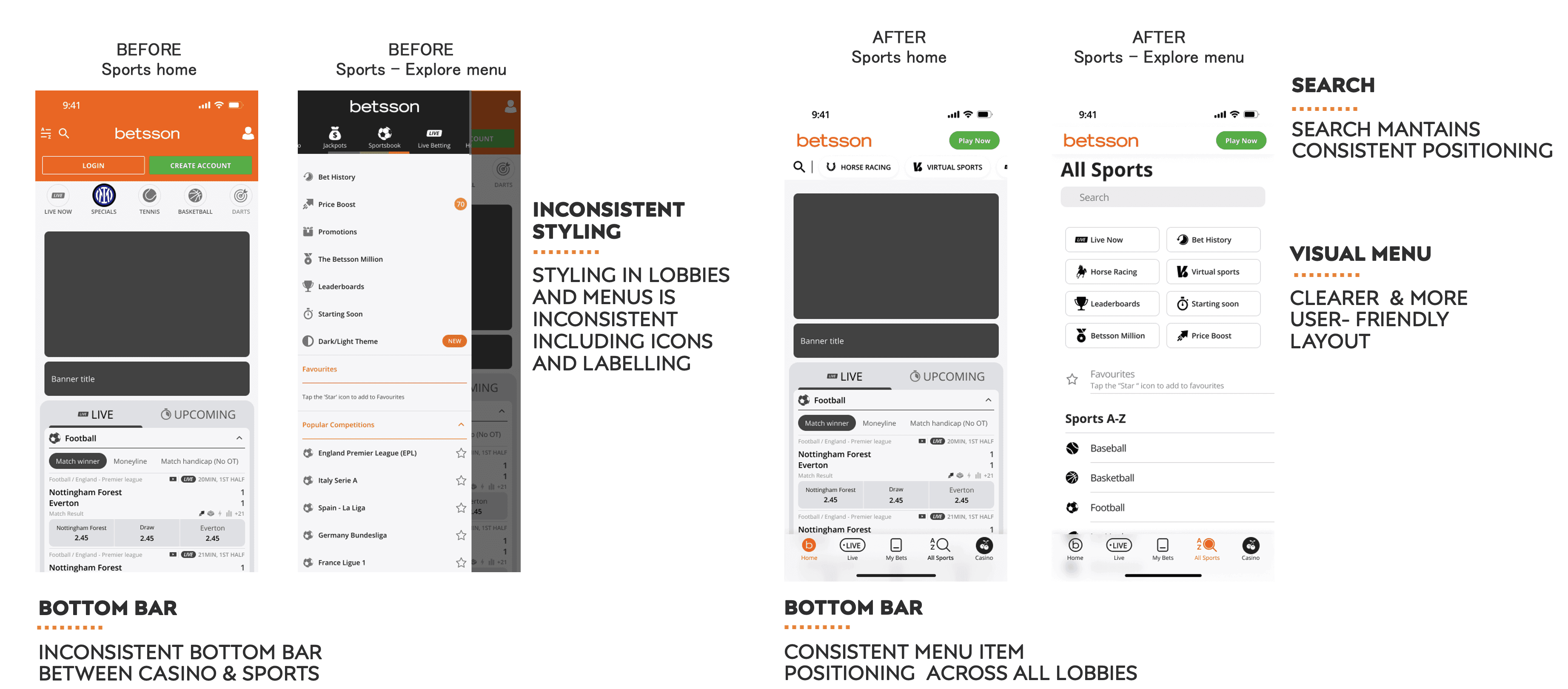
Comparison: Before vs. After
Final Look
Comparison: Before vs. After
Comparison: Before vs. After
Final Look
Final Look
Conclusion
Conclusion
Final Remarks
Final Remarks
Starting from the initial goals, the work also resulted in a redesign of the homepage, which had a significant impact on the overall UI. Unfortunately, this redesign is still in the testing phase, as parts of it are being evaluated to ensure the changes do not negatively affect users while increasing engagement and the desire to play.
I initiated and led the design up to this stage. Currently, our Central UX team is updating and creating a new design system to support and maintain modern components that will make the site look more refreshing.
In the meantime, I have transitioned to a new department within the company, so this initiative will now be led by others.
Starting from the initial goals, the work also resulted in a redesign of the homepage, which had a significant impact on the overall UI. Unfortunately, this redesign is still in the testing phase, as parts of it are being evaluated to ensure the changes do not negatively affect users while increasing engagement and the desire to play.
I initiated and led the design up to this stage.
Currently, our Central UX team is updating and creating a new design system to support and maintain modern components that will make the site look more refreshing.
In the meantime, I have transitioned to a new department within the company, so this initiative will now be led by others.
Future Improvements
Future Improvements
Update the design system to include more modernized components.
Introduce dark mode and enhance the overall color palette for better aesthetics and usability.
Begin user testing to validate improvements and gather feedback.